POSTER

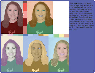
The poster project was based off a selfie of us, and recreating it as art to make a statement. We had to add a powerful saying to it that layered over the picture. I chose the colors because it worked best in bringing out the tracing well, without messing up the picture in a way that wouldn't show my face as well. If I could go back and make changes to it I would have cleaned the lines in the picture and make sure the spots where the paint was uneven were fixed. It wasn't a challenging project but taught me how important it is to pay attention to detail, and use precision when editing the poster properly. I loved the color pallet i chose, it took a little while getting the colors right because a lot of the bright fun colors can make the image look creepy.

Comments
Post a Comment