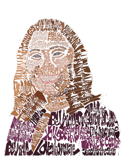
Posts

Showing posts from October, 2019

B&W to Color

Image
       This week was our first assignment in photoshop, and we took a picture of ourself and had to change it from black and white to color. We used 5 different color pallets. I think the biggest challenge was making sure colors didn't bleed through, and cleaning up the lines. Photoshop is not too hard to use, it just takes time learning all the tools, and how to use them. I think the best one out of all of them, would be the last one I did.

POSTER

Image
The poster project was based off a selfie of us, and recreating it as art to make a statement. We had to add a powerful saying to it that layered over the picture. I chose the colors because it worked best in bringing out the tracing well, without messing up the picture in a way that wouldn't show my face as well. If I could go back and make changes to it I would have cleaned the lines in the picture and make sure the spots where the paint was uneven were fixed. It wasn't a challenging project but taught me how important it is to pay attention to detail, and use precision when editing the poster properly. I loved the color pallet i chose, it took a little while getting the colors right because a lot of the bright fun colors can make the image look creepy.

Gradient Mesh

Image
      Originally for the gradient mesh I planned on doing a mason jar filled with flowers, but it was too challenging. I switched to re-creating a nail polish bottle, which wasn't too hard. I struggled with getting the color and shape right, especially the transparency part of the bottle. It wasn't too bad but for next time, I would like to create the separate shapes and make it look more like the object. The poster is going to be the next project and with that I want to do a better job with color and making it a better project.

Calligram

Image
This is the FINAL product of my calligram, and it feels good to have it completely done. I worked really hard on this project and it was probably my best work so far. I enjoyed working on this assignment the most I'd say, right along with the business logo cards. This project came the easiest to me and was something that was easier to manage. The only challenging part was adjusting all the letters and making sure the eyedropper got the right color to match the original picture as closely as possible. I've enjoyed learning about all the cool aspects Illustrator has to offer, and I'm looking forward to working on the poster and gradient mesh this week.

Logo

Image
The Logo assignment we were given started off with brainstorming words that describe our personality. After we came up with 5 words to describe us we picked our top 3 to create designs that would eventually be turned into business cards. My top 3 words I chose were thoughtful, adventurous, and creative. It took me a couple tries to find the right logos that were something more original that no one had done before. I tried to create something unique to me, and factor in other things I like not just something that matched the words. I think that I did a pretty good job on capturing my personality with the image well. The only thing I would change would be the way the card is set up, and fix the dimensions.