Posts

Portfolio

Image
   This is the final project for this class, we had to use InDesign to create a portfolio that had all the work we did throughout the semester. It was hard to use indesign and it took me a couple tries importing projects and readjusting them. I wish I had more time for this project in particular because I would have done a lot more to it. I would have added more detail to balance out the pages instead of having it so plain. The projects I enjoyed doing the most were the somewhere, calligram, autoscopy and the multiplicity. In these projects playing with background and lighting was a lot of fun. It was cool making scenes different, and creating myself in different ways. The most challenging thing for me was probably the gradient mesh, and the canvas project. At least now I know all the tips and tricks for using these softwares, and can create more projects in my classes next semester.

Multiplicity

Image
      The multiplicity project was one of my favorite assignments. For this project in particular we had top photoshop ourselves into an open space 6 different times. I decided to do a open room in a friend's house, and change my outfit so I looked like different characters. I wanted the theme for this assignment to be people winding down at night and relaxing after a long day of working. I liked playing with the lighting and different positions of myself, and putting it all together. The hardest part was probably positioning myself and taking the pictures all from the same angle of the room. 

Pixel Portrait

Image
     The assignments we had over break were a pixel portrait and a photoshopped scene of multiple versions of ourselves. This project is the pixel portrait and for this I decided to make it look like I was blushing. It was fun turning it into the animated gif. The most difficult part was adding detail, and getting it to look as close to me as possible. Drawing in pixels was challenging because you're working with squares and not straight lines. Although I did enjoy experimenting with this assignment and watching the still drawings come to life.

Autoscopy

Image
            The Autoscopy project required us to take a scanned photo, and turn ourselves into something meaningful. I decided to scan myself with a longing look towards what I wish I grew up in. The right side of my face is covered in palm trees because I grew up in Florida. The left side where I am looking at is covered in evergreen trees and snow. I have always wanted to grow up in a place where the seasons changing is noticeable. Whether that be in Georgia, or somewhere in the Carolina's that way it's not as cold as up north but the leaves change color. I also really like to travel so I think that part of me always wants to be going to a different place as often as I can. It can also symbolize how I feel about moving away, and wanting a change in my life by going to a different state.

Somewhere

Image

B&W to Color

Image
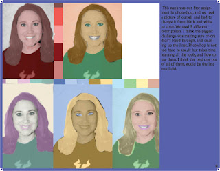
       This week was our first assignment in photoshop, and we took a picture of ourself and had to change it from black and white to color. We used 5 different color pallets. I think the biggest challenge was making sure colors didn't bleed through, and cleaning up the lines. Photoshop is not too hard to use, it just takes time learning all the tools, and how to use them. I think the best one out of all of them, would be the last one I did.

POSTER

Image
The poster project was based off a selfie of us, and recreating it as art to make a statement. We had to add a powerful saying to it that layered over the picture. I chose the colors because it worked best in bringing out the tracing well, without messing up the picture in a way that wouldn't show my face as well. If I could go back and make changes to it I would have cleaned the lines in the picture and make sure the spots where the paint was uneven were fixed. It wasn't a challenging project but taught me how important it is to pay attention to detail, and use precision when editing the poster properly. I loved the color pallet i chose, it took a little while getting the colors right because a lot of the bright fun colors can make the image look creepy.